
Portfolio Design
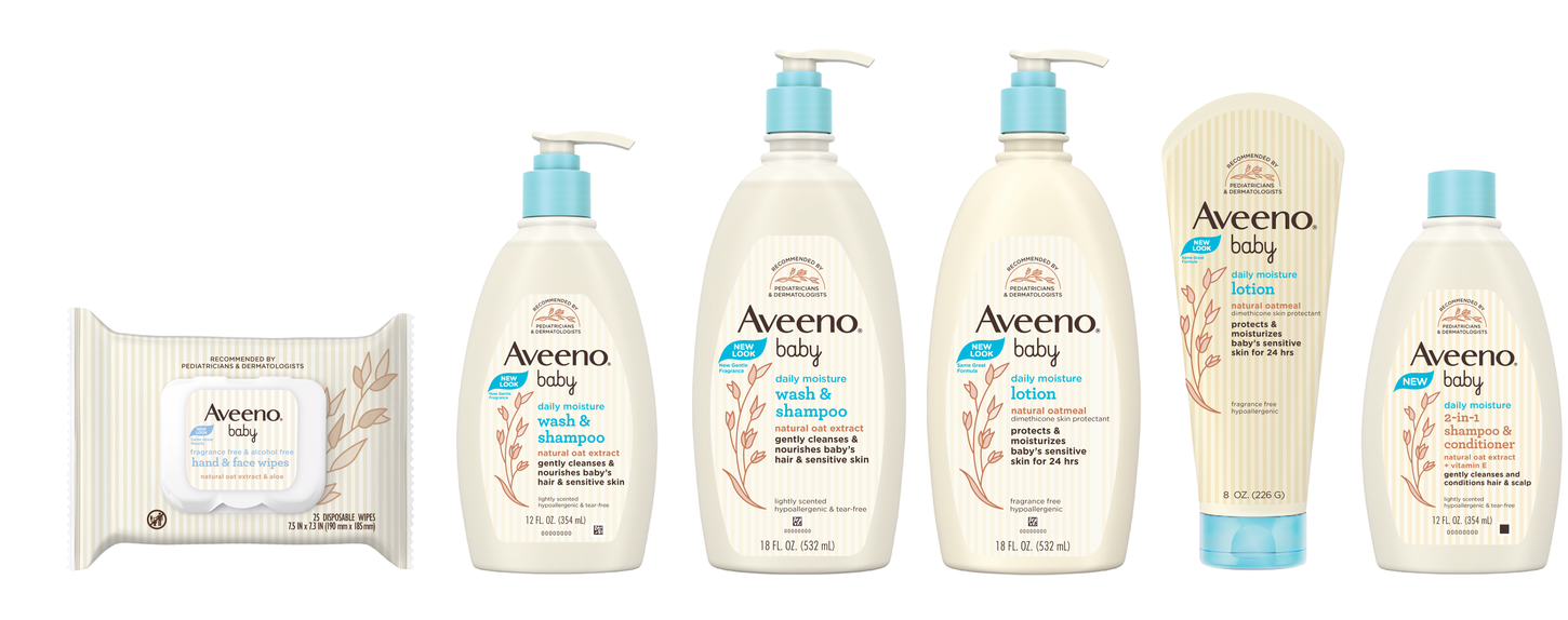
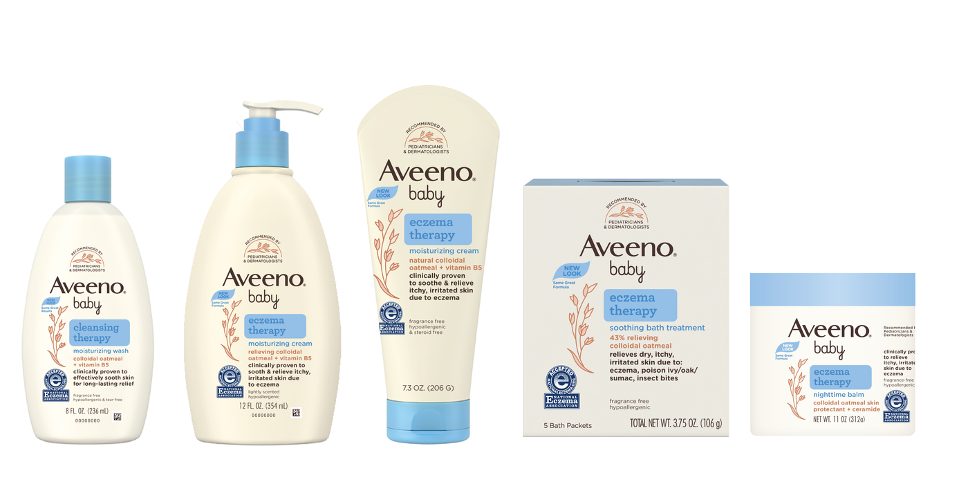
Leveraging a refreshed logo, typography, and illustration, the label architecture was streamlined
to reflect clear tiering and ensure consumer navigability at-shelf.


Winning with consumers
In consumer research, the new packaging design increased consumers' purchase preference by 60 points, according to Designalytics. Moreover, it performed significantly better on the top 12 most important attributes in the baby care category, beating the old design by a range of 46 to 58 points.

Illustration & Iconography
Ingredients play a pivotal role in the Aveeno Baby proposition. Illustration style and iconography was developed to tell a stronger oat ingredient story and support transparent communication of product formulation.
Modernizing an iconic brand
to maintain relevancy
Concept Development
E2E Management
Identity & Logo
Brand Strategy
Illustration
Cross-Functional Collaboration
Packaging
E-Commerce
Social Media
Aveeno Baby
Brand Refresh
In 2018, the Aveeno Baby brand was in need of an update to reflect its continued leadership in the baby personal care category. The brand and packaging were refreshed to best evoke its focus on sensitive skin care with an approach informed by a balance of science and nature.
While multiple evolutionary to revolutionary concepts were explored, the new design maintained the brand's distinctive champagne color, stripes, and doctor recommended seal, while using illustration to better highlight the brand's key category ingredient differentiator: oats. Changing the navy logo and typography to a dark brown created a more coherent visual feel, while the "baby" script was re-drawn to feel cleaner and more sophisticated.
The refreshed brand and packaging increased consumer purchase preference by 60 points, and bested the previous design on all top 12 category attributes by an average of 50 points.
In collaboration with
Melinda Brechbuehler, Senior Designer
Becka Redante, Designer
Jennifer Dahl, Director
Paul Owen, Senior Director


