Band-Aid Brand
Visual + Verbal Identity
Overview
The Band-Aid visual and verbal identity was refreshed to reflect the "You + Band-Aid" brand platform approach. Keeping the iconic logo and red color intact, new visual elements were added along with an updated verbal tonality that resonates with consumers of all ages.
Color
Band-Aid's iconic red was complemented by a fresh, contrasting color palette that instantly adds energy and a youthful vibe.
A secondary color palette featuring a range of skin tones signal's Band-Aid's move toward a more inclusive future.
Shape & Texture
The rounded bandage shape was leveraged to create a graphic element that can be used to crop images, as a viewport, or as an architectural background element when turned vertically.
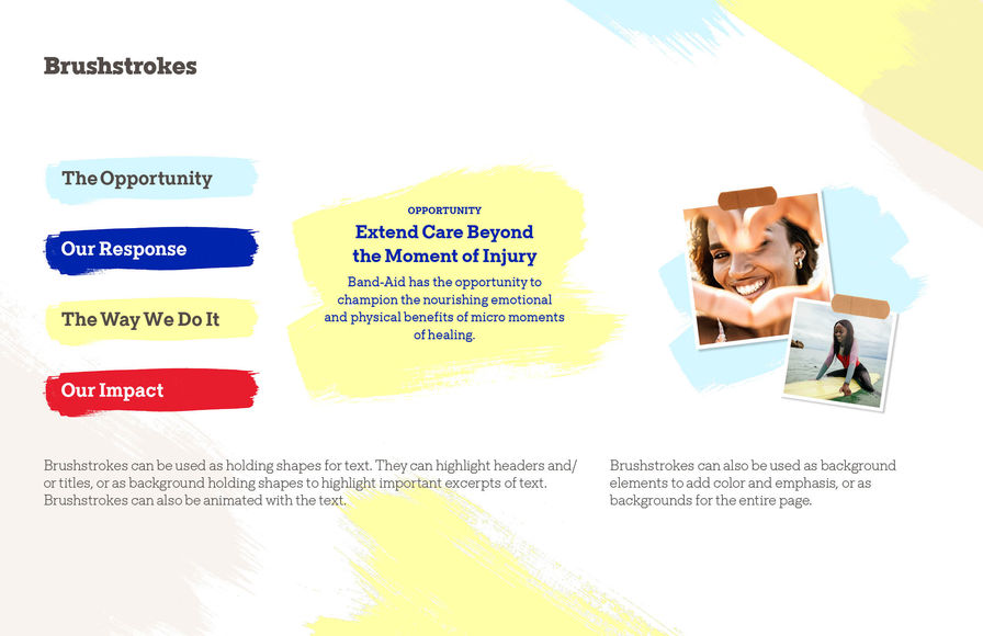
Brushstrokes appear playfully throughout, providing texture and holding shapes for headlines, and nod to Band-Aid's renewed commitment to individual expression.
Illustration & Photography
Clean & simple illustration style provides flexibility for visual content and storytelling.
Lifestyle photography adds a human touch, with warm lighting and a candid, everyday style with subjects from a wide range of ages and backgrounds.
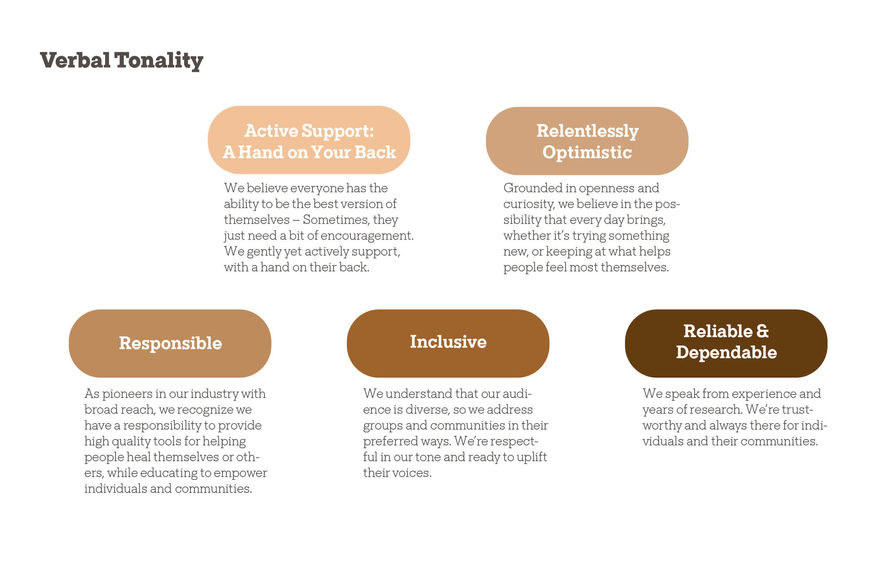
Verbal Tonality
Band-Aid's verbal language strives to evoke the brand's values of inclusivity and empathy, taking a caring and warm, yet friendly, upbeat, and approachable, tone in all communications.


